

Getting Started
Introduction
Cognee organizes your data into AI memory.
 Give Cognee your documents, and it creates a graph of raw information, extracted concepts, and meaningful relationships you can query.
Why AI memory matters
When you call an LLM, each request is stateless: it doesn’t remember what happened in the last call, and it doesn’t know about the rest of your documents. That makes it hard to build applications that actually use your documents and carry context forward. You need a memory layer that can link your documents together and create the right context for every LLM call.How Cognee works
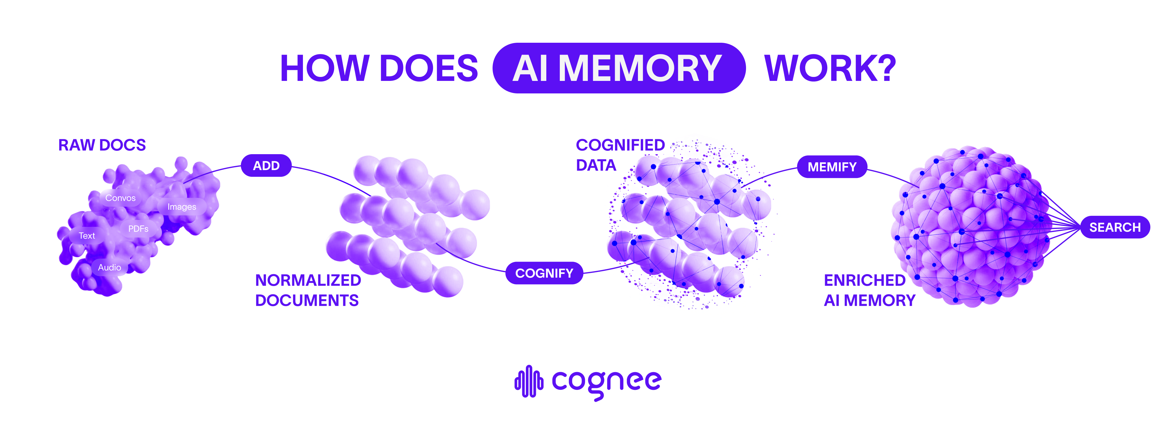
When it comes to your data, Cognee knows what matters. There are three key operations in Cognee:-
.add— Prepare for cognification
Send in your data asynchronously. Cognee cleans and prepares your data so that the memory layer can be created. -
.cognify— Build a knowledge graph with embeddings
Cognee splits your documents into chunks, extract entities, relations, and links it all into a queryable graph, that serves as the basis for the memory layer. -
.search— Query with context
Queries combine vector similarity with graph traversal. Depending on the mode, cognee can fetch raw nodes, explore relationships, or generate natural-language answers through RAG. It always creates the right context for the LLM. -
.memify— Semantic enrichment of the graph (coming soon, stay tuned)
Enhance the knowledge graph with semantic understanding and deeper contextual relationships.
Ready to get started?
Set up your environment
Installation GuideSet up your environment and install Cognee to start building AI memory.
Run your first example
Quickstart TutorialGet started with Cognee by running your first knowledge graph example.
Keep exploring
Core ConceptsDive deeper into Cognee’s powerful features and capabilities.